Why we as designers should not waste time searching for inspiration on Dribbble, when the typography of our choice can give us more inspiration and clues than we will ever need.
How do you start any Ul design project ?
# Staring at a blank artboard?
# Trying to find inspiration on Dribbble and Behance?
What if we told you there is a more technical way of going about it.
Start with your choice of typography. Study it in detail.
The typography you choose has enough complex personality to point you towards what your UI design should look and feel like.
For example, lets observe the letter "t" in Roboto:
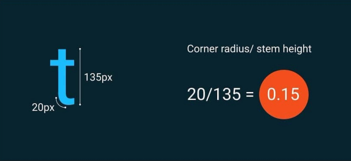
The goal here is to study the relationship between the various features of Roboto. Hence ratios are calculated.
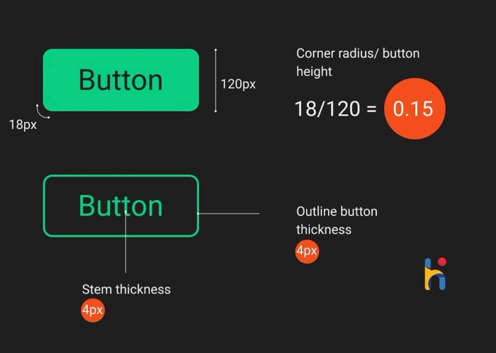
We can use this clue to decide the corner radius of our button.
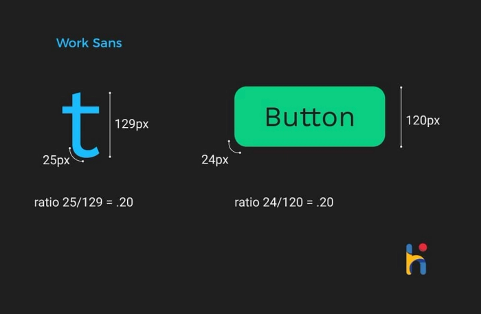
If we used work sans as our button text, a similar rule will follow:
What if you decide to use line icons for your interface?
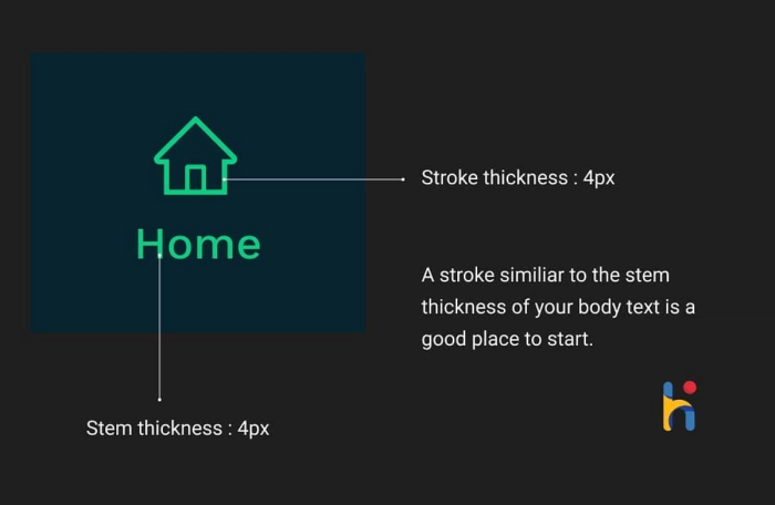
Now, it is important to note that the letter "t" is used just as an example here. Using rounded corners is just a matter of personal choice.
More time you spend studying the typography, the more nuanced and elegant your design !
The most commonly occuring alphabets in english literature are:
"e, a, r, i, o, t, n, s, I, c".
– These are a good set of alphabets to study.
